
A console table is one of the easiest surfaces in a home to get wrong.
Too empty, and it looks unfinished. Too full, and it looks like a catch-all.
The twelve ideas below work, but only when they're applied through a couple of simple rules first.
Those rules matter more than any single object on the list.
The One Rule Behind Every Good Console Table
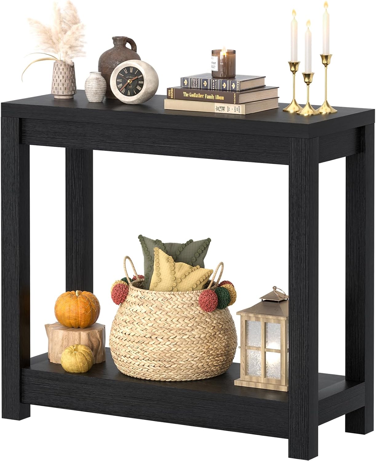
Scale and restraint beat quantity, every time.
A console table isn't a shelf for overflow — it's a curated surface, closer to a gallery pedestal than a junk drawer.
Three to five objects, each with its own reason for being there, consistently outperforms a table covered edge to edge.
Everything placed on it should earn its spot.

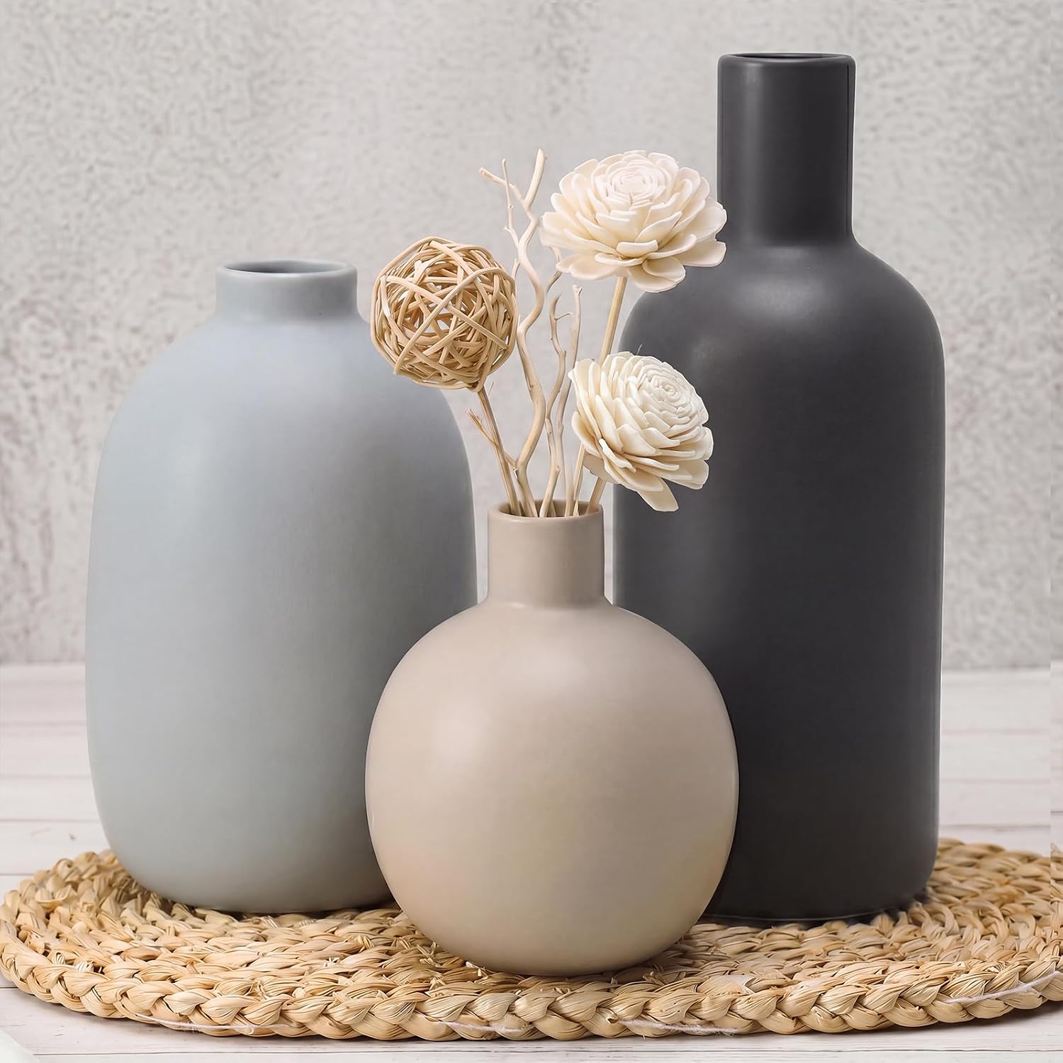
Avoiding the Clutter Trap
Clutter on a console table rarely happens all at once — it builds up one small addition at a time.
A useful check: if an object doesn't add height, texture or a focal point, it's probably filler.
Grouping in odd numbers (threes work especially well) tends to look more natural than pairs or even rows.
Leaving visible empty space on the table is a deliberate choice, not a sign something's missing.


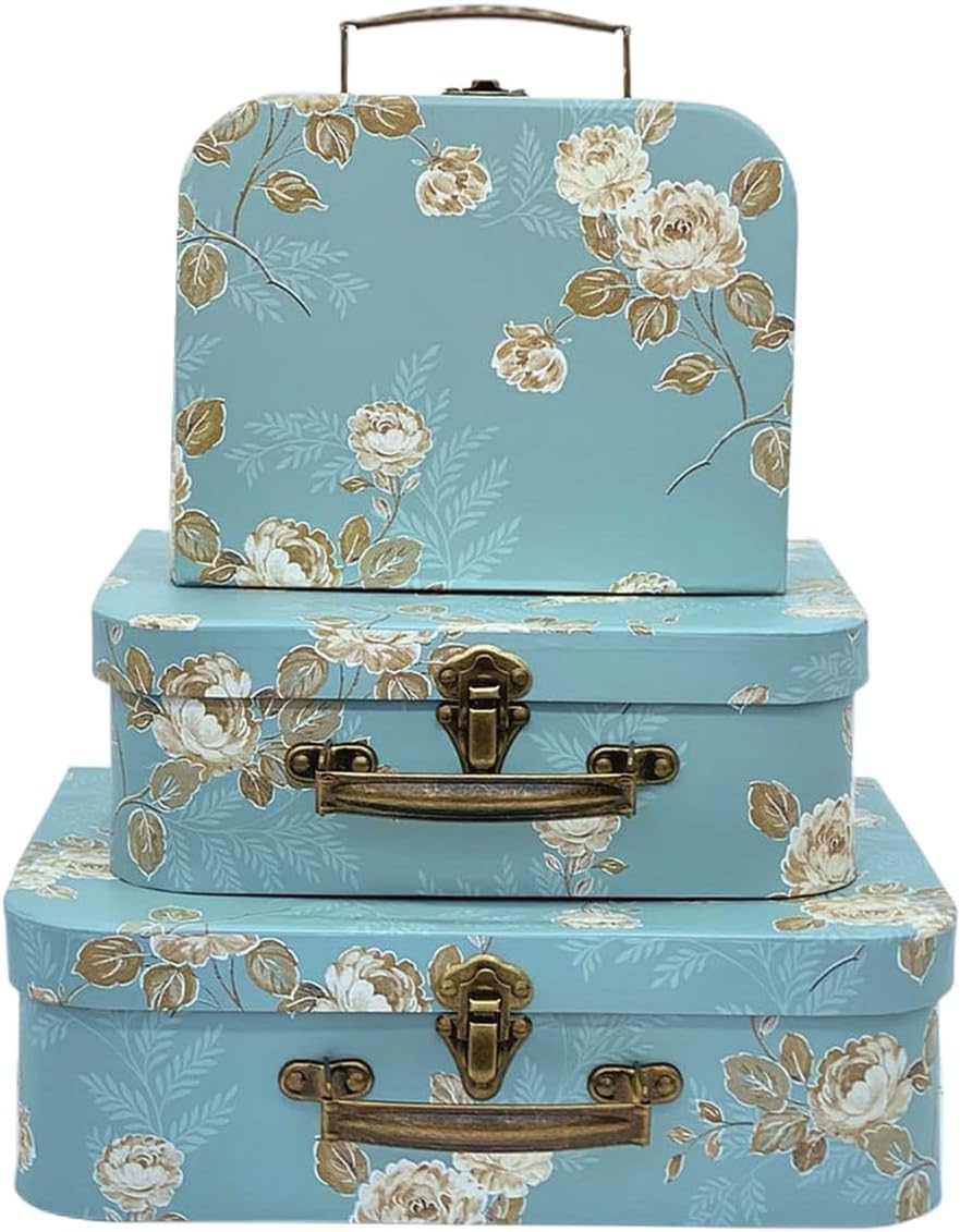
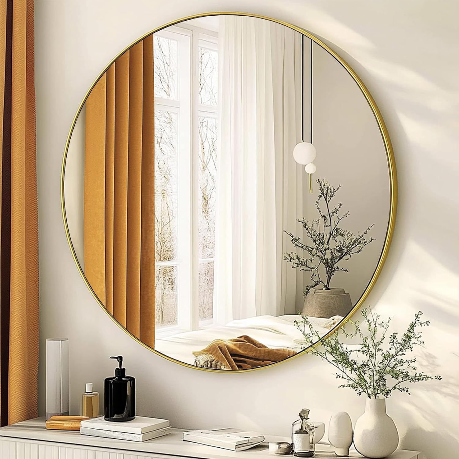
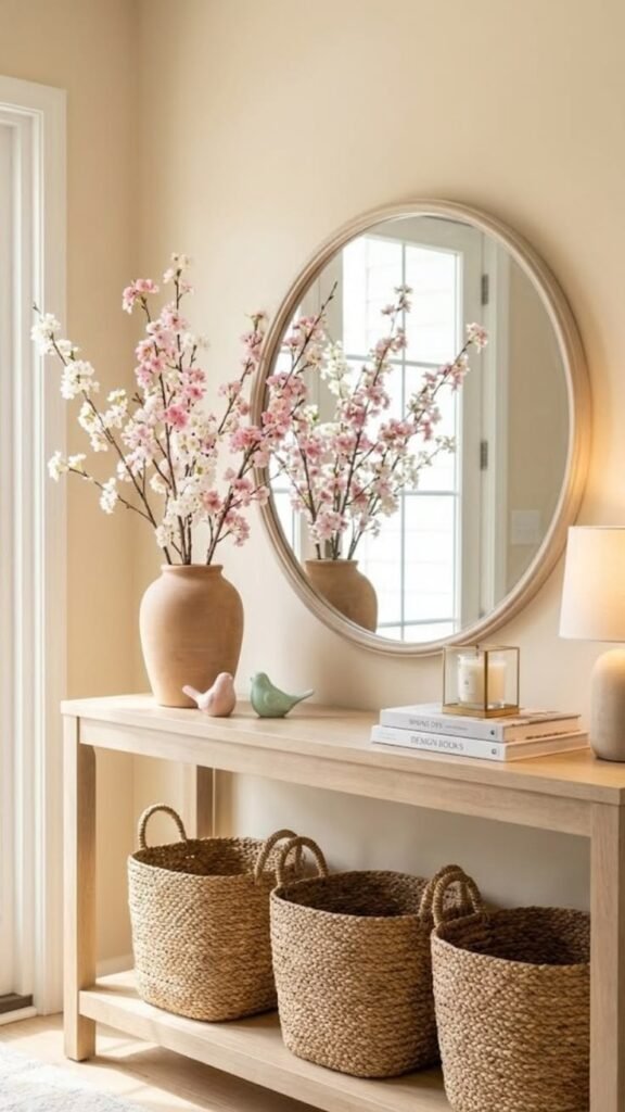
1. A Statement Mirror
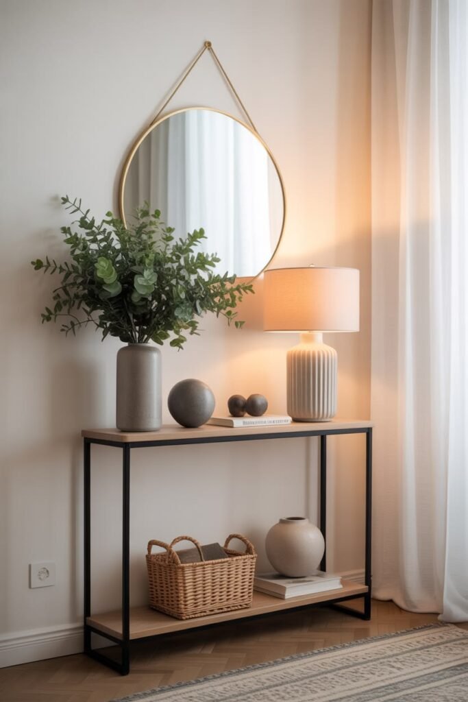
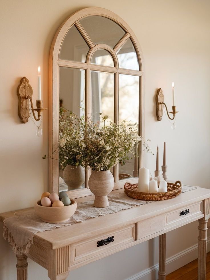
A mirror above a console table does double duty — it anchors the wall and bounces light back into the room.
An oversized or uniquely shaped mirror reads as the clear focal point, which frees up the table below to stay simpler.
This works especially well in a hallway or entry with limited natural light.
Once the mirror is in place, everything else on the table becomes supporting detail.
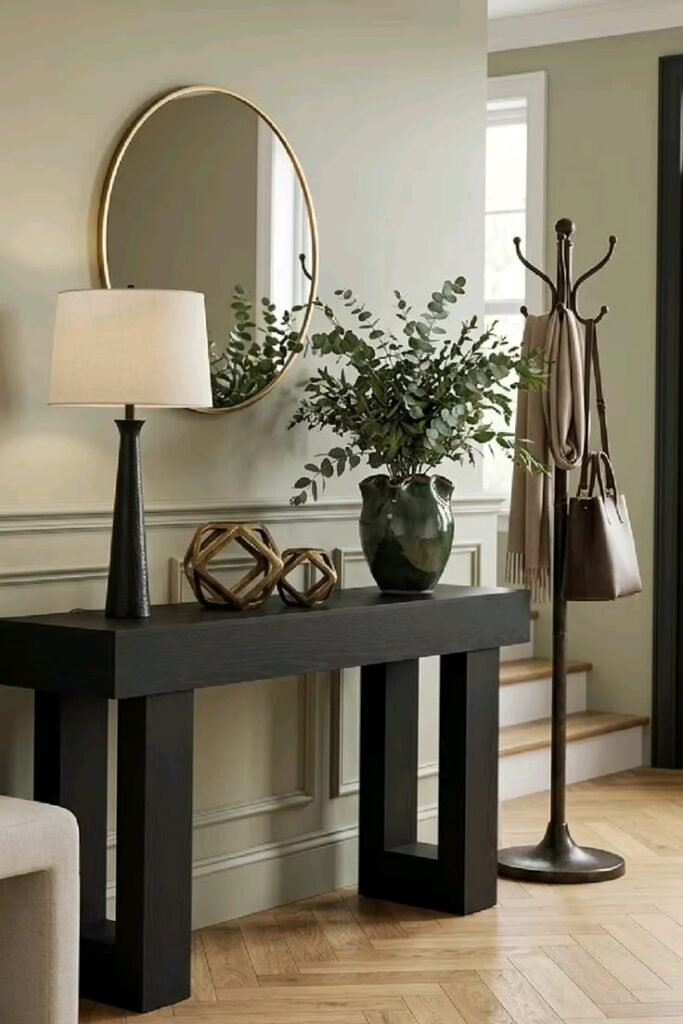

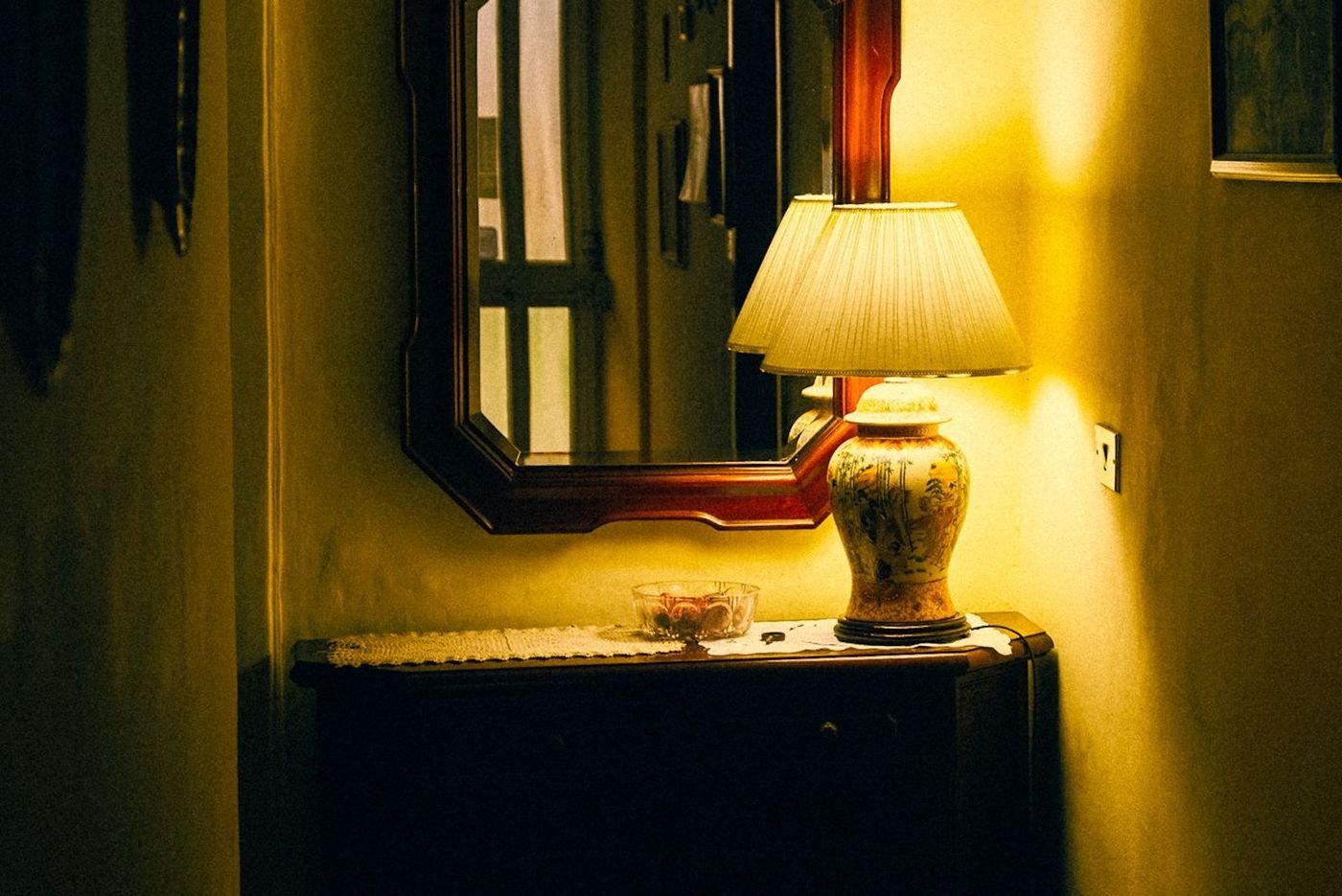
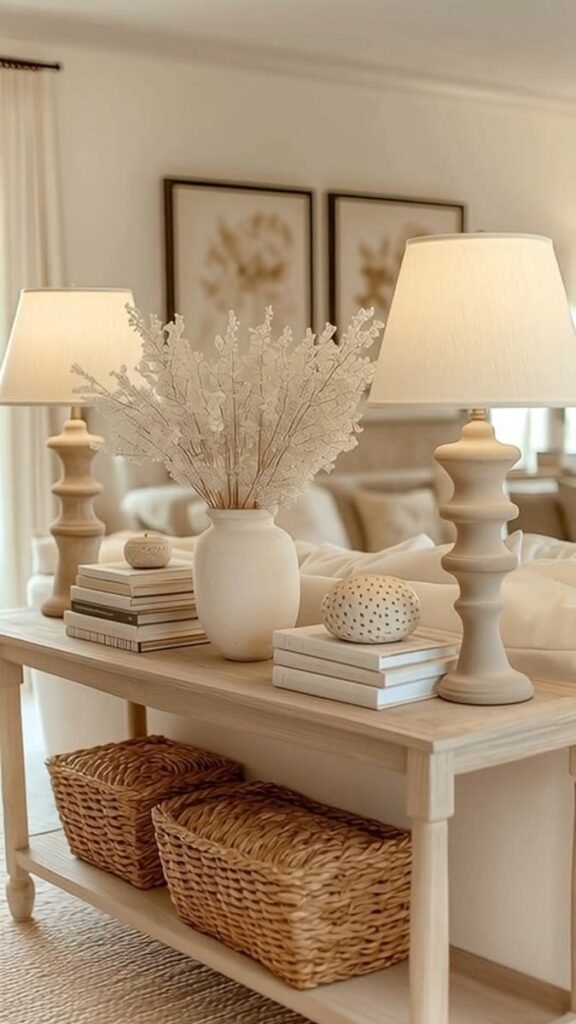
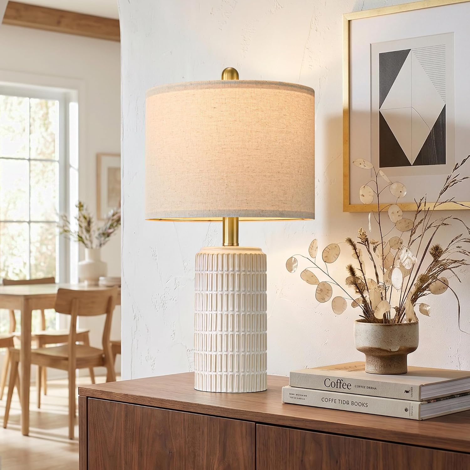
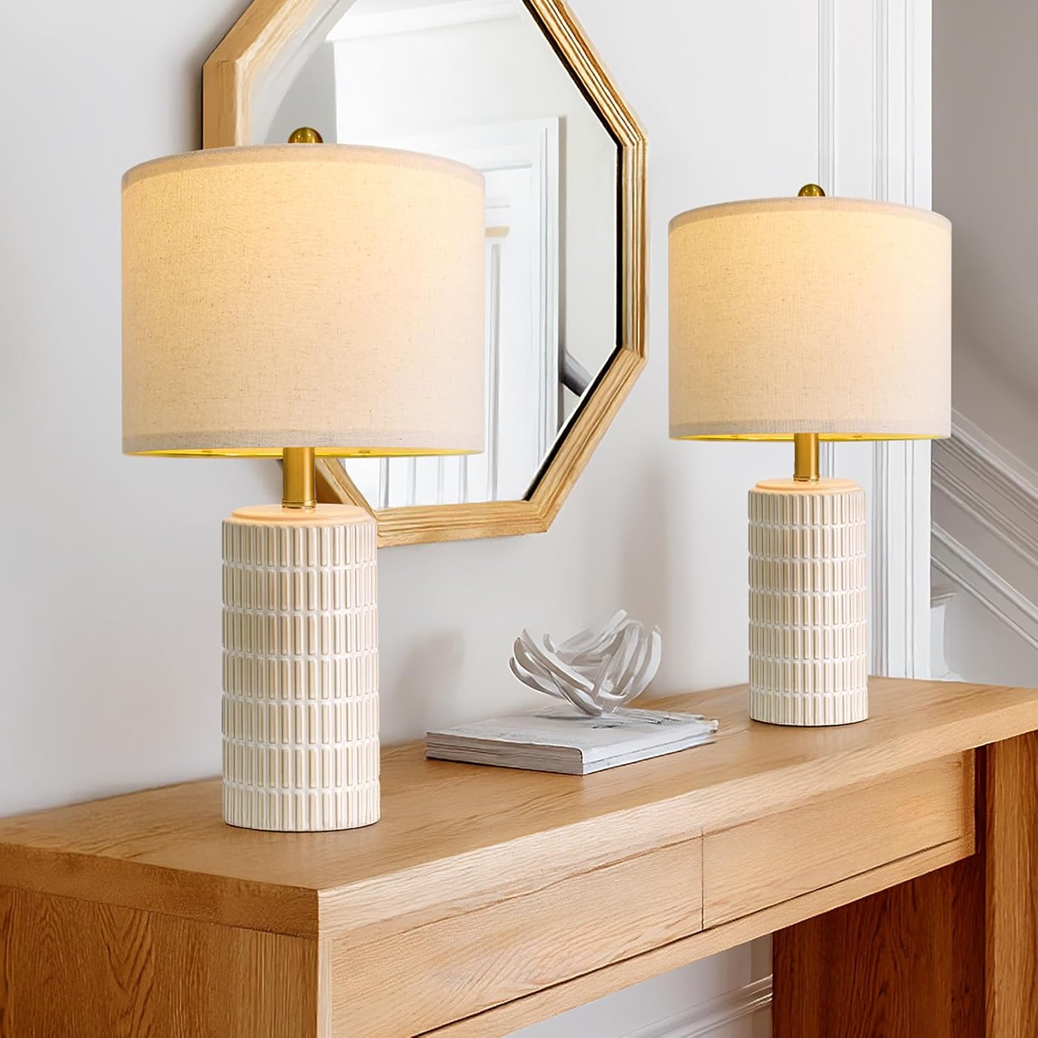
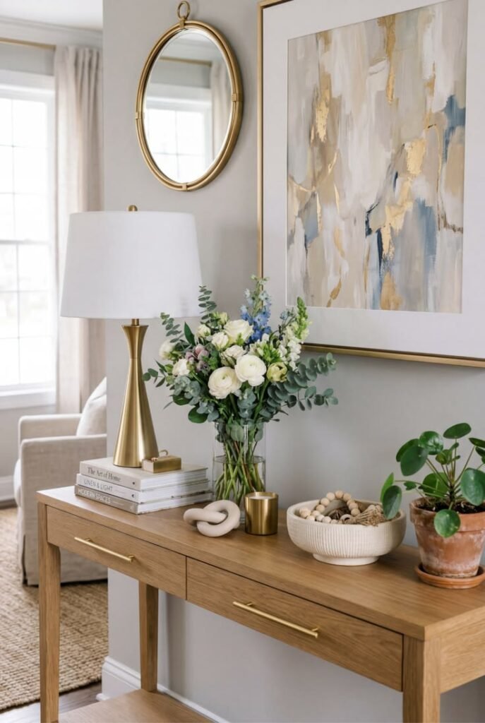
2. A Lamp for Warmth
Overhead lighting alone tends to leave a console table looking flat.
A table lamp adds warmth at a human height, especially in the evening when overhead lights feel harsh.
It also adds genuine height variation without needing another tall decorative object.
A lamp earns its spot on nearly every console table, functional or purely decorative.
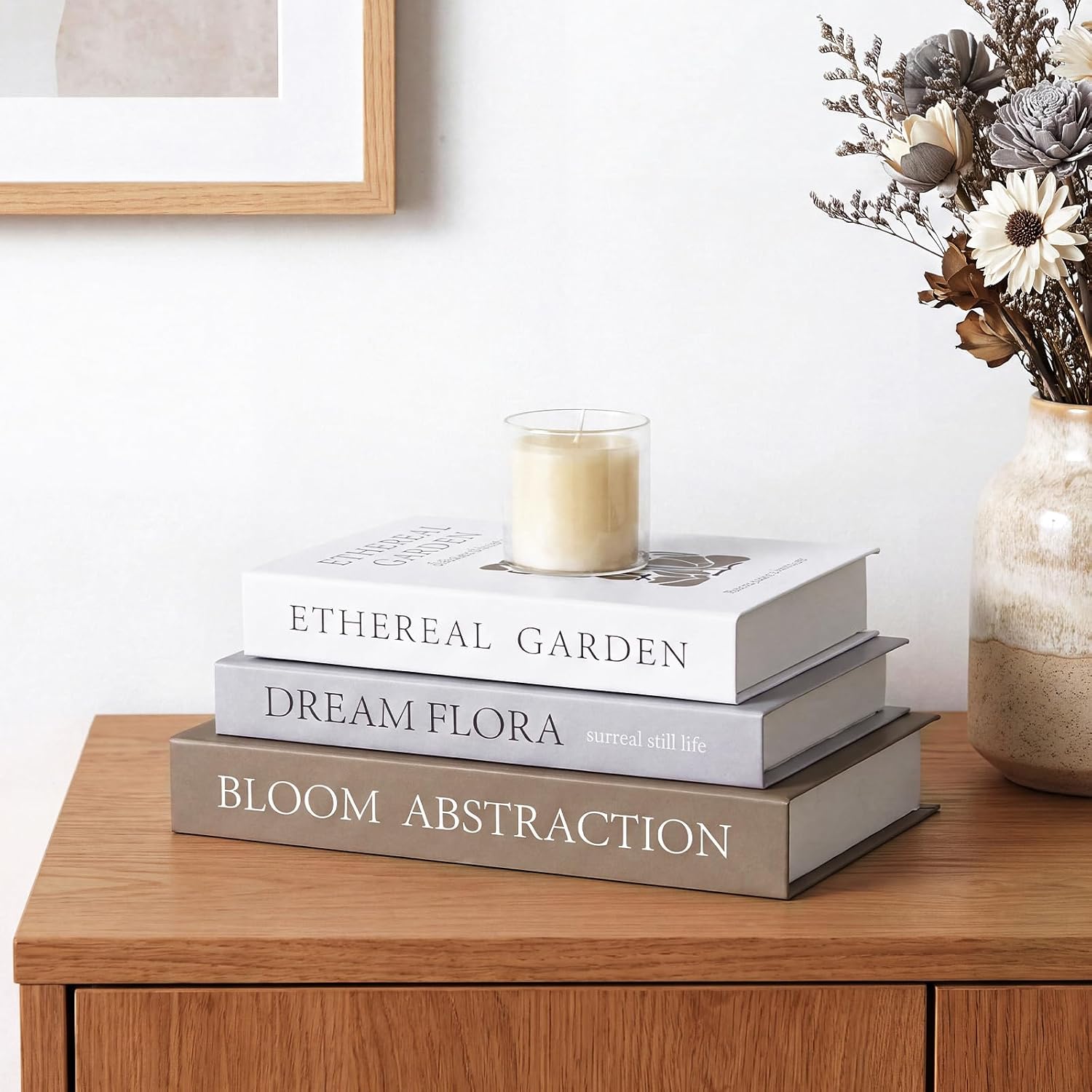
3. A Small, Curated Book Stack
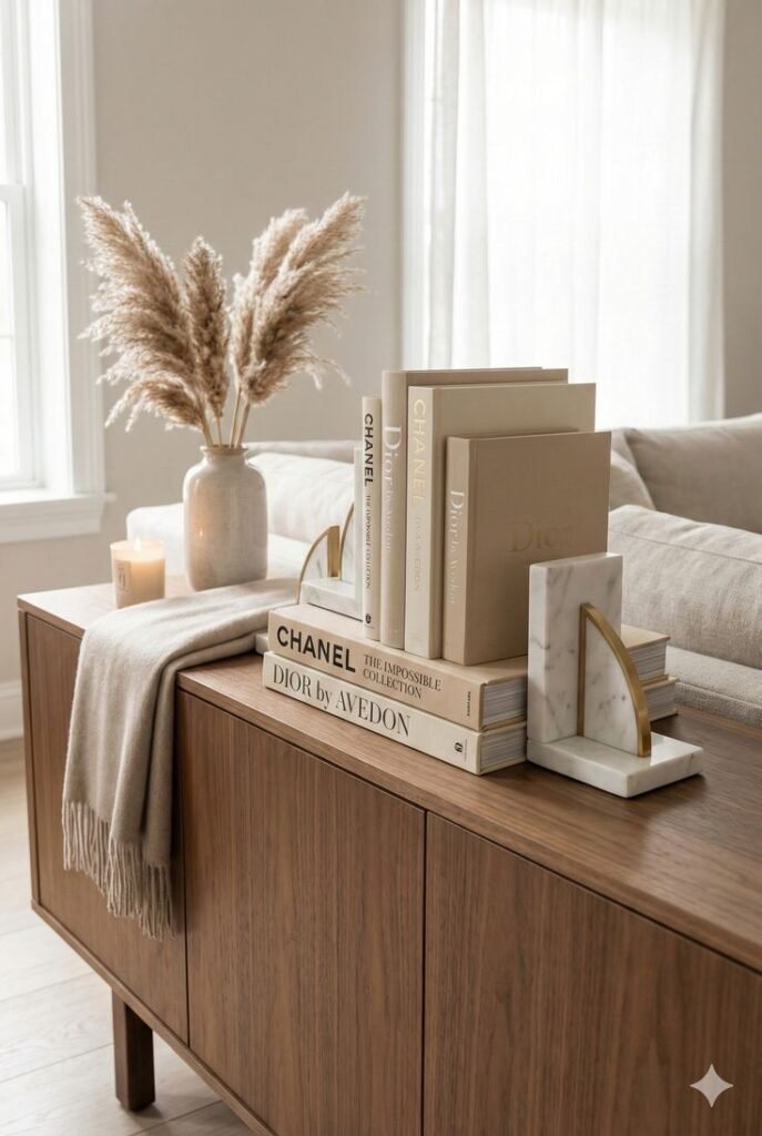
Books add color, texture and a bit of personality that most other objects can't match.
A stack of two or three, chosen for their spines rather than grabbed at random, reads as intentional.
Topping the stack with a small object adds a natural finishing touch.
This works whether the books actually get read or simply looked at.

4. A Touch of Greenery
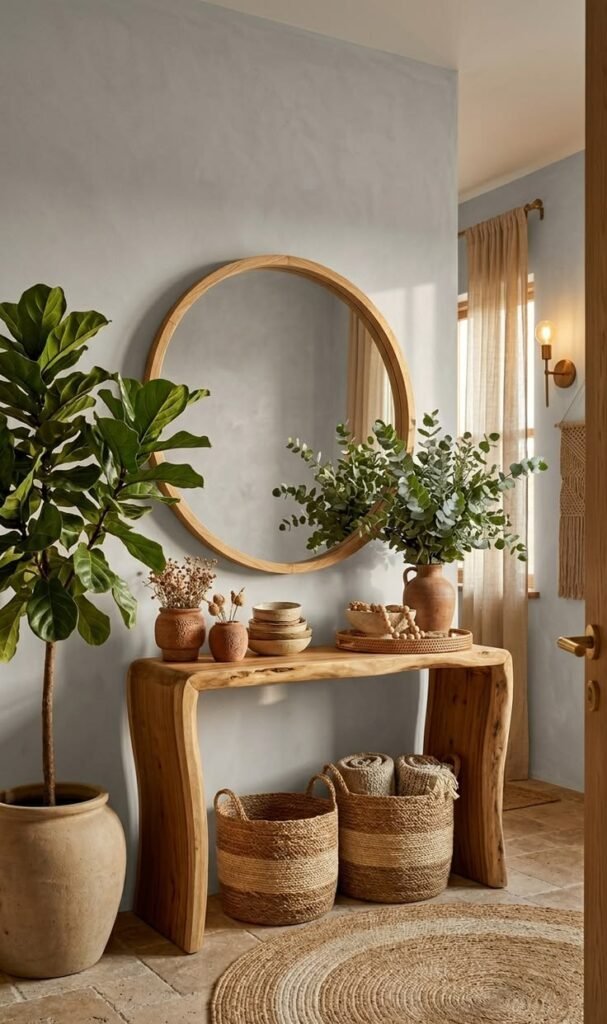
A console table without a single plant or stem tends to feel sterile.
Real or faux both work — what matters is scale and placement, not which one it is.
A tall stem adds height on one side; a low, compact plant softens a corner.
Greenery is one of the easiest additions to swap out without disturbing anything else on the table.


5. One Piece of Artwork
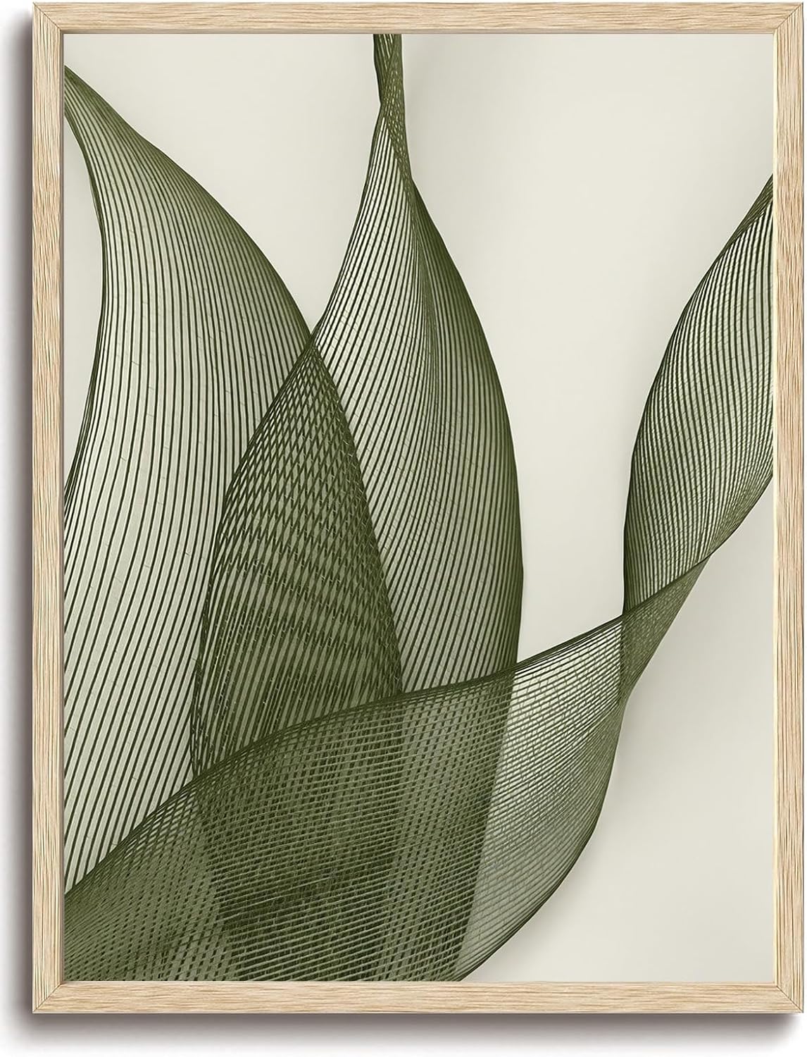
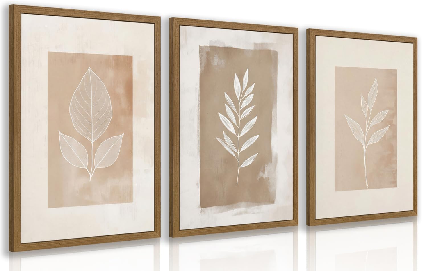
A single framed piece leaned against the wall behind the console adds personality without needing to be mounted.
It also gives the eye somewhere to land that isn't the mirror or the tabletop itself.
Leaning, rather than hanging, keeps the look casual and easy to change later.
This works especially well paired with a smaller or lower mirror.
6. A Decorative Tray for Structure
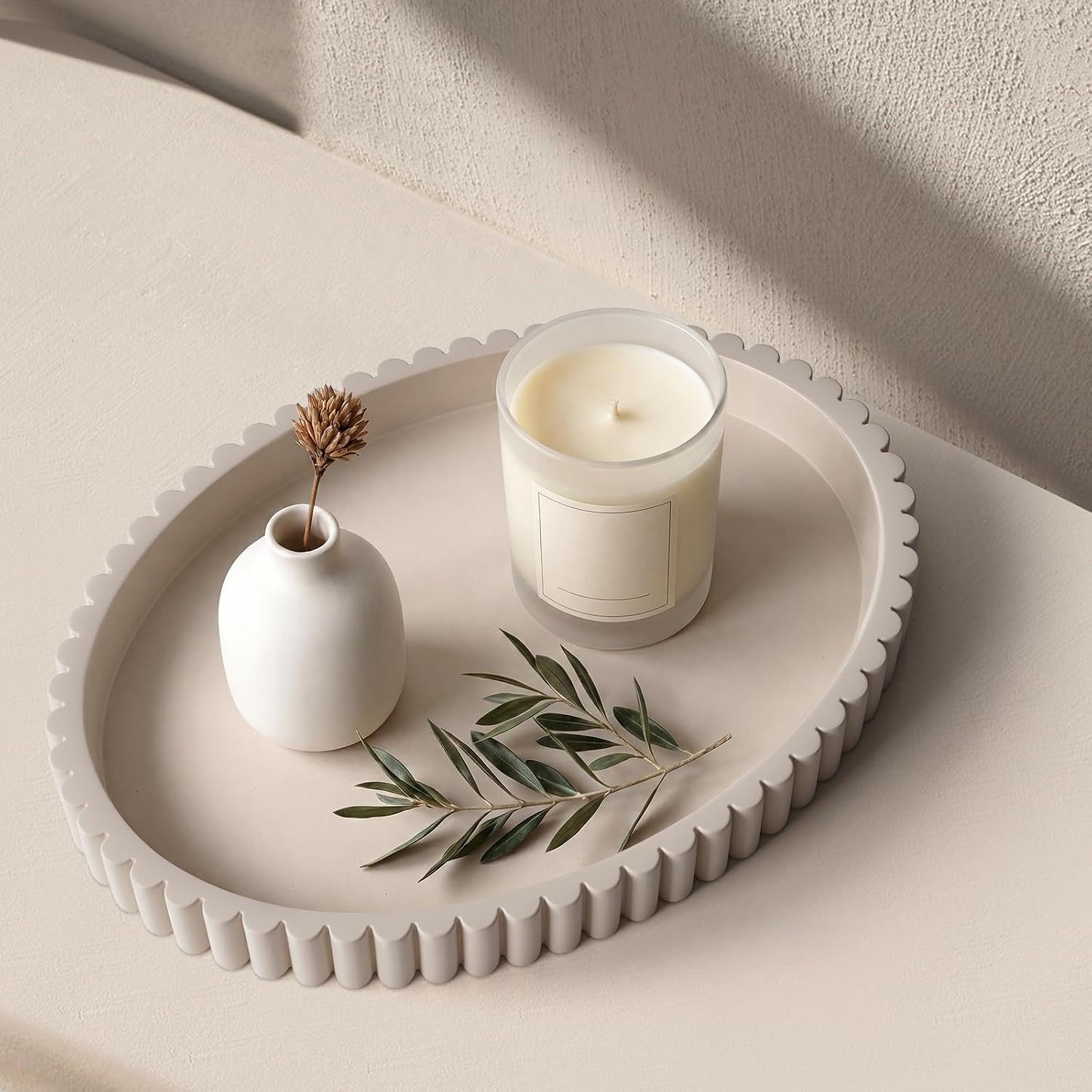
A tray groups smaller items into one visual unit instead of letting them scatter across the surface.
It also protects the table finish from keys, mail or anything else that lands there daily.
Wood, metal or woven materials all work, depending on the table's overall style.
This is one of the simplest ways to make a functional catch-all spot still look styled.

7. A Few Personal Pieces
A photo, a travel memento, or a meaningful small object keeps a console table from feeling like a showroom display.
The key word is a few — one or two personal pieces add warmth, five or six start to look cluttered.
Editing down to the most meaningful items is harder than adding more, but it pays off visually.
This is what makes a styled table feel like it actually belongs to someone.
8. Deliberate Height Variation
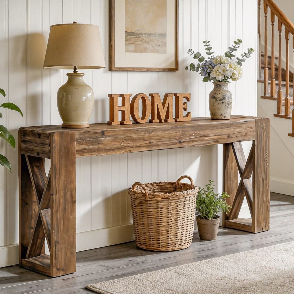
A row of same-height objects reads as flat, no matter how nice each piece is individually.
One tall item, one medium, one low accent creates a visual rhythm the eye naturally follows.
This principle applies whether the table is styled with three objects or eight.
It's one of the fastest ways to make an existing arrangement look more intentional without buying anything new.

9. Symmetry for a Clean Look
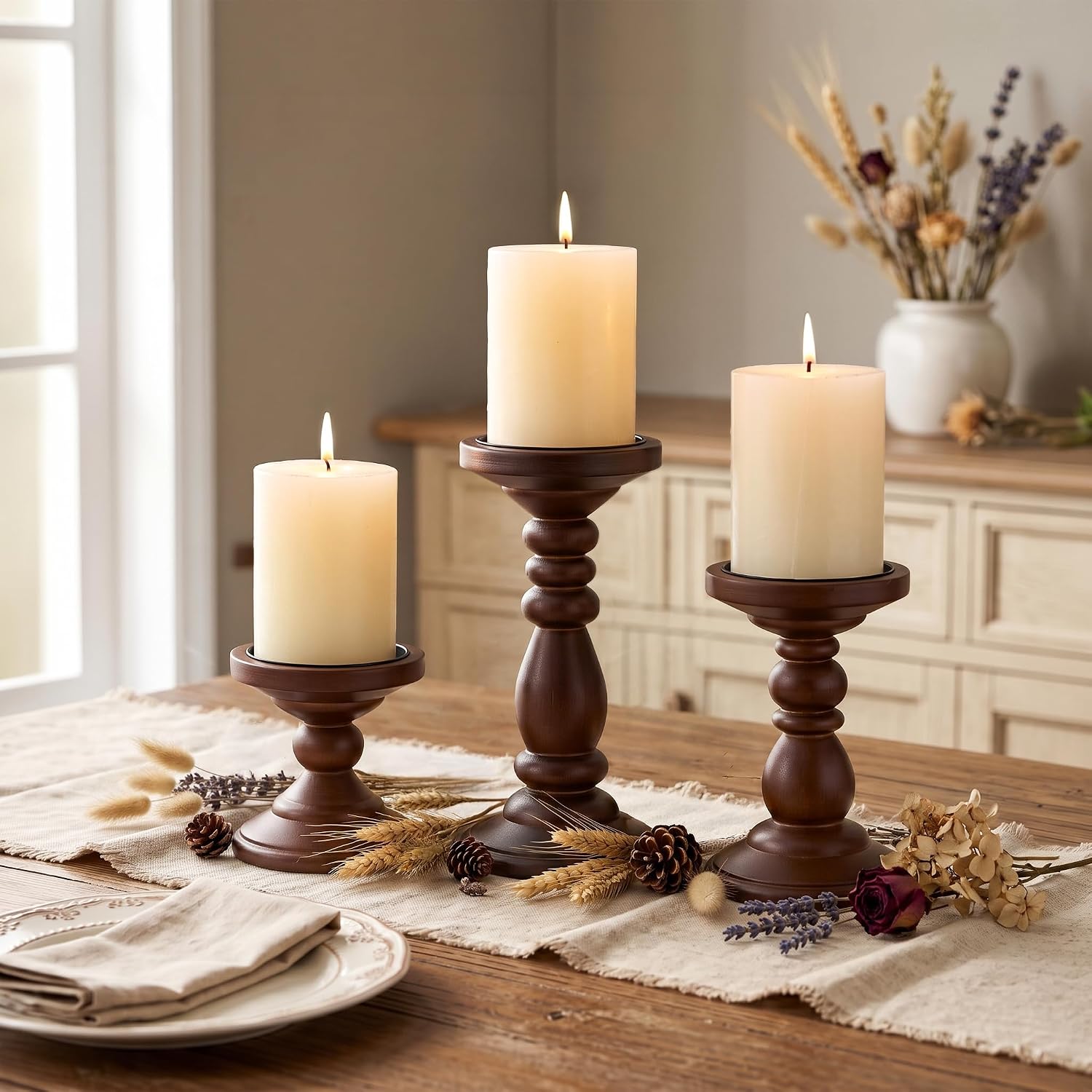
Matching lamps, vases or candlesticks placed in mirrored pairs reads as calm and formal.
This suits a more traditional or classic home, where balance matters more than spontaneity.
Symmetry is also one of the easiest styling approaches to execute without much trial and error.
It's a dependable default when nothing else on this list feels like the right fit.

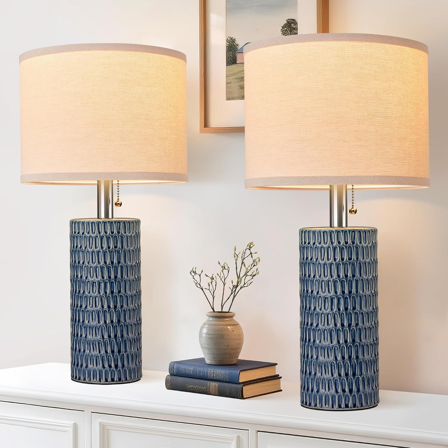
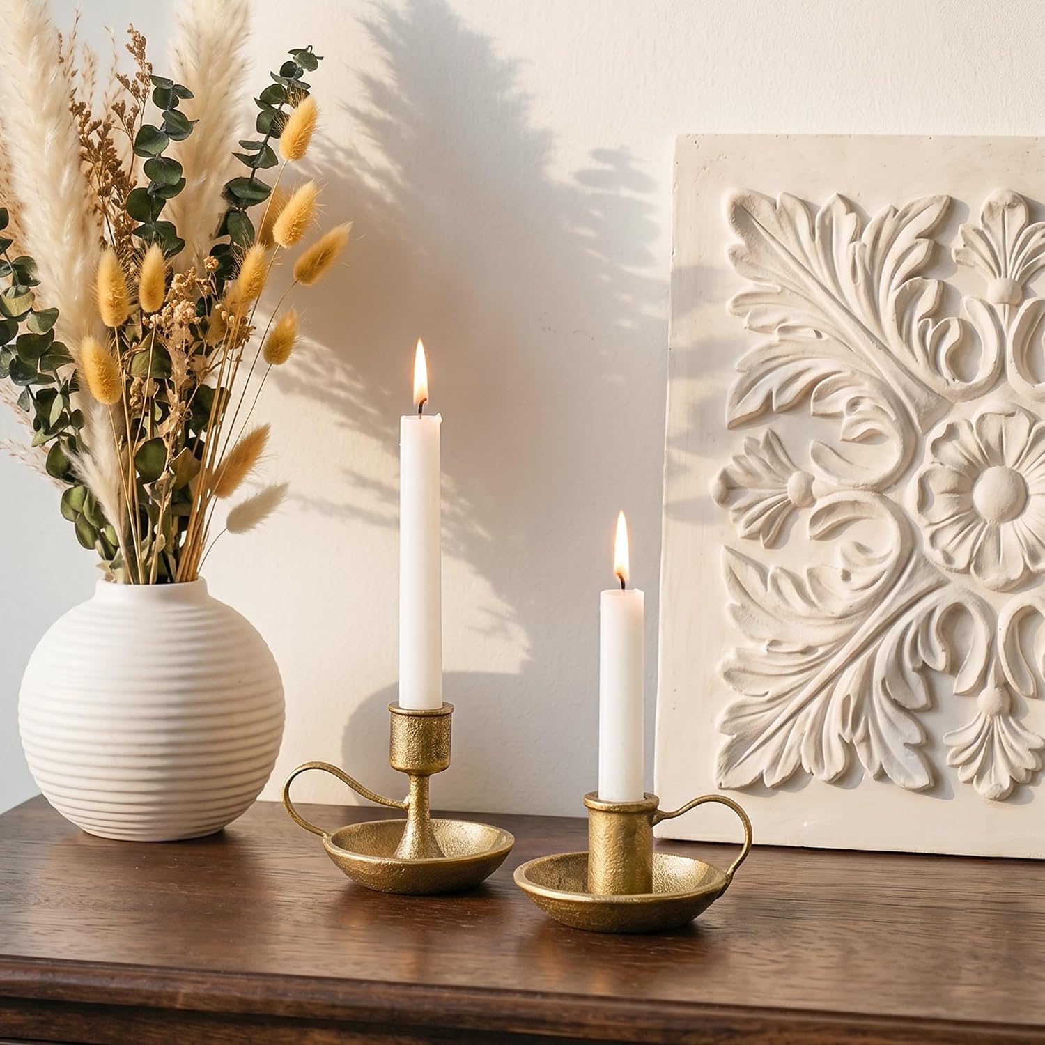
10. Asymmetry for a Relaxed Feel
An off-center arrangement feels more collected and less staged than a perfectly mirrored one.
This suits a more eclectic or lived-in home, where the goal isn't formal balance.
Asymmetry still needs visual weight distributed across the table — one side can't be completely empty.
It takes a bit more trial and error to get right than symmetry does, but it tends to feel more personal once it lands.


11. Layering for Depth
Placing objects at different depths — not just different heights — adds dimension a flat row can't achieve.
A taller piece in back, something mid-sized slightly forward, and a small accent in front of that.
This technique works well combined with either the symmetrical or asymmetrical approach above.
It's a small adjustment that makes an already-decent arrangement look noticeably more considered.


12. Updating It Seasonally
A console table doesn't need to stay static year-round.
Swapping a few key pieces — a seasonal stem, a different-colored object, a holiday accent — keeps the space feeling current without a full restyle.
Keeping the base layer (tray, lamp, mirror) constant and rotating just the smaller accents makes seasonal updates quick.
This is the easiest way to get more visual mileage out of a table that's already working.
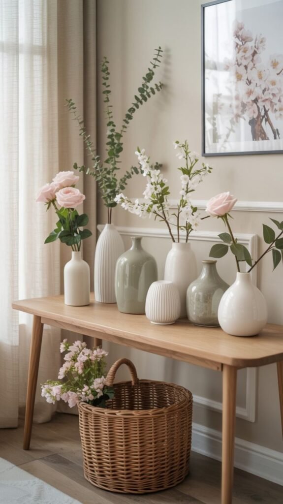



Making It Look More Expensive
A higher-end look usually comes down to fewer, better-chosen pieces rather than a bigger budget.
Repeating one or two materials — the same metal finish, the same wood tone — across several objects reads as cohesive and considered.
Negative space is doing more work than most people give it credit for; a table that isn't crammed automatically looks more expensive.
The cheapest upgrade on this entire list is simply taking something off the table, not adding something new to it.
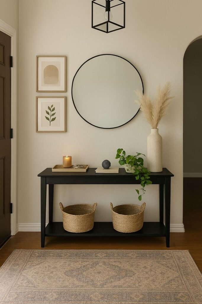


Final Thoughts
None of these twelve ideas work in isolation from the two rules at the top.
Scale, restraint and intentional negative space matter more than which specific objects end up on the table.
Start with the rule, then pick two or three ideas from the list that actually fit the space.
A console table that looks put-together usually has less on it, not more.